The CollectionView is a flexible and coherent view to display the data list in different layouts for the Specifications view. It is swift and more flexible, which removes the concept of ViewCells.
Difference between CollectionView and ListView
- CollectionView has a flexible layout, which allows the data to be present in vertically or horizontally, in a list or a grid.
- CollectionView supports the single and multiple selections in the list of data.
- CollectionView is automatically virtualize using native controls.
- CollectionView has no concept of cells. It can be use textcell, imagecell, viewcell to present the data.
- CollectionView diminishes the API surface of ListView.
- CollectionView does not support in-built separators.
CollectionView is only available in iOS and Android Application, and partially available on the UWP (Universal Windows Platform).
Populate the CollectionView with data
A CollectionView is occupied with the data by backdropping its Items Source property to dispense the data.
<collectionview>
  <collectionview.itemssource>
    <x:array type="{x:Type x:String}">
      <x:string>Red</x:string>
      <x:string>Green</x:string>
      <x:string>Blue</x:string>
      <x:string>Yellow</x:string>
      <x:string>Orange</x:string>
      </x:array>
  </collectionview.itemssource>
</collectionview>
Types of Layouts in CollectionView
There are four types of layout in a CollectionView in below:
- Vertical List Layout
- Horizontal List Layout
- Vertical Grid Layout
- Horizontal Grid Layout
1) Vertical List Layout
- The list of data can be presented in a single-column list that grows vertically as new items are added.
- By default, Layout is CollectionView of the vertical list layout.
2) Horizontal List Layout
- The list of data can be presented in a single row list that enhances Horizontally as new items are added.
3) Vertical Grid Layout
- The list of data can be presented in a multiple-column grid that augments Vertically as new items are added.
4) Horizontally Grid Layout
- The list of data can be presented in Multiple row grid that pile up Horizontally as new items are added.
CollectionView Properties:
1) ItemLayoutOrientation
It can be defined as the layout of the list of the data.
2) SnapPointsAlignment
Specify the snap point if they are aligned with the items.
3) SnapPointType
Specify the behavior of a snap point when scrolling the list of data.
4) VerticalItemSpacing
It represents the vertical empty space around each item. The default value is 0.
5) HorizontalItemSpacing
It represents the Horizontal empty space around each item. The default value is 0.
6) Header
Specify the string, binding that will be displayed at the beginning of the list.
7) Footer
Define the string, binding that will be displayed at the end of the list.
8) HeaderTemplate
Designate the Datatemplate to use format the data in the header.
9) FooterTemplate
Stipulate the Datatemplate to utilize the format of data in Footer.
10) ItemSizingStrategy
There is two enumeration members but you can set one of the members in ItemSizingStrategy.
- MeasureAllItems: In this type, all the items are individually measured.
- MeasureFirstItem: Only the one item is measured
11) Selection Mode
There is three selection mode in the below:
- none: Indicates the none item selected.
- Single: Indicates the first item selected.
- Multiple: Indicates the multiple items selected.
It can be select only for one out of three enumerable members of selection mode.
12) EmptyView
It can display the string, binding, or view that will be display when the Itemsource is null or empty. Empty View default value is null.
13) EmptyViewTemplate
Specify the template to use to format the specify EmptyView.
14) ItemSource
Bind the list of data in CollectionView.
15) ItemsUpdatingScrollMode
This property gets an enumeration value that represent the scrolling behavior of CollectionView when new items are added.
There are three enumeration member defines in the following:
- KeepItemsInView: Adjust the first visible item displayed.
- KeepScrollOffset: Maintain the scroll offset relative to beginning of the list.
- KeepLastItemInView: Adjust the scroll offset to keep the last item visible.
Events in CollectionView
1) SelectionChangedCommand
This event is executed when the selected item changes.
2) SelectionChangedCommandParameter
It means the parameter that’s passed to the selectionChangedCommand.
3) Scrolled
This event is fired to indicate the scrolling occurred.
Grouping in CollectionView:
If you can display large amount of data, then use the Group in CollectionView for Presenting the data.
Grouping Properties:
1) IsGrouped
This property uses the Boolean type for the undelaying data to be display using group.
2) GroupHeaderTemplate
This property to use for the header of each group.
3) GroupFooterTemplate
This property is to use for the footer of each group.
By default, CollectionView display the grouping name in the group header and footer but you can easily customize the group header and group footer.
Example of CollectionView
Using Vertical Grid Layout:
MainPage.Xaml
<!--?xml version="1.0" encoding="utf-8" ?-->
<contentpage xmlns="http://xamarin.com/schemas/2014/forms" xmlns:x="http://schemas.microsoft.com/winfx/2009/xaml" xmlns:local="clr-namespace:CollectionViewDemo" x:class="CollectionViewDemo.MainPage">
    <scrollview>
    <stacklayout heightrequest="100" widthrequest="500">
        <!-- Place new controls here -->

        <collectionview itemssource="{Binding Datalist}" backgroundcolor="#ffffff">
            <collectionview.itemslayout>
                             <griditemslayout orientation="Vertical" span="3">
            </griditemslayout></collectionview.itemslayout>

            <collectionview.itemtemplate>
                                <datatemplate>
                                    <grid rowspacing="0" columnspacing="0" heightrequest="200" widthrequest="300">
                                        <grid.columndefinitions>
                                            <columndefinition width="Auto">
                                            <columndefinition width="Auto">
                                        </columndefinition></columndefinition></grid.columndefinitions>

                                        <grid.rowdefinitions>
                                            <rowdefinition height="Auto">
                                        </rowdefinition></grid.rowdefinitions>

                            <img source="{Binding CheckboxImg}" aspect="AspectFill" margin="0,0,0,0" x:name="checkboxImg" grid.column="0" grid.row="0" heightrequest="20" widthrequest="20">


                        <label text="{Binding CodeTitle}" fontsize="12" textcolor="Black" verticaloptions="Center" horizontaloptions="StartAndExpand" grid.column="1" grid.row="0">
                                    </label></grid>
                                </datatemplate>
                            </collectionview.itemtemplate>
        </collectionview>

    </stacklayout>
    </scrollview>
</contentpage>
Class File: DemoViewModel.cs
using System;
using System.Collections.Generic;
using System.Collections.ObjectModel;
using System.Text;
namespace CollectionViewDemo.ViewModel
{
public class DemoViewModel
{
private ObservableCollection<signaturecodecheckboxpopupclass> datalist;
public ObservableCollection<signaturecodecheckboxpopupclass> Datalist
{
get { return datalist; }
set { datalist = value; }
}
public DemoViewModel()
{
Datalist = new ObservableCollection<signaturecodecheckboxpopupclass>();
Datalist.Add(new SignatureCodeCheckboxPopupClass() { CodeTitle = "Introduction to Work Environment", CheckboxImg = "unchecked_checkbox.png" });
Datalist.Add(new SignatureCodeCheckboxPopupClass() { CodeTitle = "Introduction to Work Environment", CheckboxImg = "unchecked_checkbox.png" });
Datalist.Add(new SignatureCodeCheckboxPopupClass() { CodeTitle = "Introduction to Work Environment", CheckboxImg = "unchecked_checkbox.png" });
Datalist.Add(new SignatureCodeCheckboxPopupClass() { CodeTitle = "Introduction to Work Environment", CheckboxImg = "unchecked_checkbox.png" });
Datalist.Add(new SignatureCodeCheckboxPopupClass() { CodeTitle = "Introduction to Work Environment", CheckboxImg = "unchecked_checkbox.png" });
Datalist.Add(new SignatureCodeCheckboxPopupClass() { CodeTitle = "Introduction to Work Environment", CheckboxImg = "unchecked_checkbox.png" });
Datalist.Add(new SignatureCodeCheckboxPopupClass() { CodeTitle = "Introduction to Work Environment", CheckboxImg = "unchecked_checkbox.png" });
Datalist.Add(new SignatureCodeCheckboxPopupClass() { CodeTitle = "Introduction to Work Environment", CheckboxImg = "unchecked_checkbox.png" });
Datalist.Add(new SignatureCodeCheckboxPopupClass() { CodeTitle = "Introduction to Work Environment", CheckboxImg = "unchecked_checkbox.png" });
Datalist.Add(new SignatureCodeCheckboxPopupClass() { CodeTitle = "Introduction to Work Environment", CheckboxImg = "unchecked_checkbox.png" });
}
}
public class SignatureCodeCheckboxPopupClass : BaseViewModel
{
private string _checkboxImg { get; set; }
public string CheckboxImg
{
get => _checkboxImg;
set
{
_checkboxImg = value;
NotifyPropertyChanged();
}
}
public string CodeTitle { get; set; }
}
}
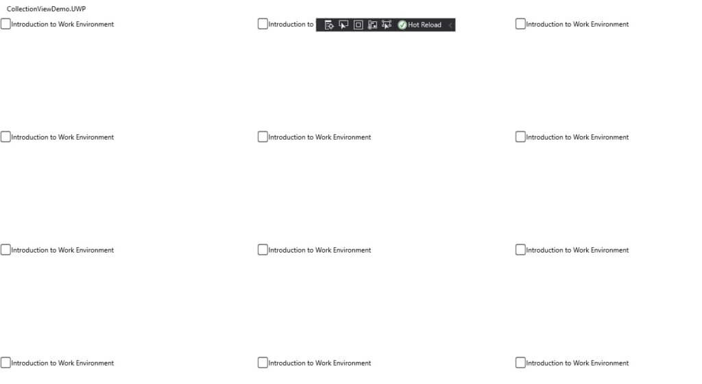
Output of this
Conclusion
The CollectionView is deliberated to be a descendant to the ListView, enhancing upon its design by minimizing technical intricacy and permitting for more pliability of layout and function.
Author Bio:
Ajay Patel – Technical Director, iFour Technolab Pvt Ltd. A Seasoned technocrat with years of experience building technical solutions for various industries using Microsoft technologies. Wish sharp understanding and technical acumen, have delivered hundreds of Web, Cloud, Desktop and Mobile solutions and is heading the technical department at Mobile App Development Company – iFour Technolab Pvt. Ltd.