Angular Material is a UI/UX library for Angular developers. Just like Bootstrap, Angular Material provides a bunch of in-build components like Bootstrap includes a bunch of classes. Implementation of Angular Material is way more different than Bootstrap. We will see about that later in this article.
Why Should You Use Angular Material?
If you are using Angular for application development, Angular Material is one of the best and easiest ways of creating a decent and attractive UI.
Developers at Google, as well as core contributors of the ionic framework, are actively developing the Angular Material library. So you can expect the latest, up-to-date components or features in this.
How to Implement Angular Material in your application?
It’s not that hard to use Material in your angular application. Just focus on what you want as an output and then install that particular module in your application and use it. Let’s try to understand it step by step with the help of an example.
Understanding Angular Material with an Example
Step 1: Create your application by writing the following command in your terminal.
ng new YouAppName
You will be asked with a couple of questions to set up your project and provide more support.
- Set routing for your project. Select ‘Y’ to add Angular routing.
- Stylesheet format, select SCSS.
Step 2: Now let’s add Material to your application. You will have to add the following command in your terminal.
ng add @angular/material
- After a few seconds, you will see a bunch of options, asking you which prebuilt theme you want to use and there will be a link right beside each option which will allow you to see a preview of that particular option.
- There will be another question asking you whether you want to set the style as global or not. As per our perspective, say yes but it’s totally depended on you and your project requirements.
- The last question will be whether you want to set browser animations for angular material, select yes.
Step 3: Now let’s implement angular material input fields in your project.
You will have to import a couple of Material component from angular/material in your app.module.ts file.
import {MatInputModule} from '@angular/material/input';
import {MatFormFieldModule} from '@angular/material/form-field';
import {FormsModule, ReactiveFormsModule} from '@angular/forms';
import {MatCardModule} from '@angular/material/card';
import {MatButtonModule} from '@angular/material/button';
Add the following to the @NgModule > import sections.
    MatInputModule,
    MatFormFieldModule,
    FormsModule,
    ReactiveFormsModule,
    MatCardModule,
    MatButtonModule
Here is how the app.module.ts file looks:
import { BrowserModule } from '@angular/platform-browser';
import { NgModule } from '@angular/core';

import { AppRoutingModule } from './app-routing.module';
import { AppComponent } from './app.component';
import { BrowserAnimationsModule } from '@angular/platform-browser/animations';
import { MatInputModule } from '@angular/material/input';
import { MatFormFieldModule } from '@angular/material/form-field';
import { FormsModule, ReactiveFormsModule } from '@angular/forms';
import { MatCardModule } from '@angular/material/card';
import { MatButtonModule } from '@angular/material/button';
import { MatIconModule } from '@angular/material/icon';


@NgModule({
  declarations: [
    AppComponent
  ],
  imports: [

    MatInputModule,
    MatFormFieldModule,
    FormsModule,
    ReactiveFormsModule,
    MatCardModule,
    MatButtonModule,
    BrowserModule,
    AppRoutingModule,
    BrowserAnimationsModule
  ],
  providers: [],
  bootstrap: [AppComponent]
})
export class AppModule { }
Step 4: Add the following HTML in your app.component.html file.
<div class="container text-center">
    <div class="row">
      <div class="col-md-4"> </div>
      <div class="col-md-4">
        <mat-card class="RegistrationCard">
          <form class="userLogin">
            <mat-card-title color="primary">LogIn</mat-card-title>
            <mat-form-field class="inputFileds" appearance="outline">
              <mat-label>Username</mat-label>
              <input matinput="">
            </mat-form-field>
            <br>
            <mat-form-field class="inputFileds" appearance="outline">
              <mat-label>Password</mat-label>
              <!--here --> <input matinput="">
            </mat-form-field>
            <br>
            <!--here --><button class="loginbtn" mat-flat-button="" color="primary">Log In</button>
          </form>
        </mat-card>
      </div>
      <div class="col-md-4"></div>
    </div>
  </div>
For better design we have added few style properties as well to app.component.scss:
body{
    background-color:rebeccapurple;
  }
.RegistrationCard {
    background-color: darken($color: lavenderblush, $amount: 0);;
    position: absolute;
    left: 35%;
    box-shadow: 1px 1px 9px 1px rgba(0, 0, 0, 0.2), 0px 1px 1px 0px rgba(0, 0, 0, 0.14), 0px 1px 3px 0px rgba(0, 0, 0, 0.12);
    width: 400px;
}
.inputFileds {
    width: 300px;
}
.loginbtn {
    display: block;
    margin: 0 auto;
}
.userLogin {
    margin-top: 20px;
}
Here is the output:

Angular Material Demo Screen
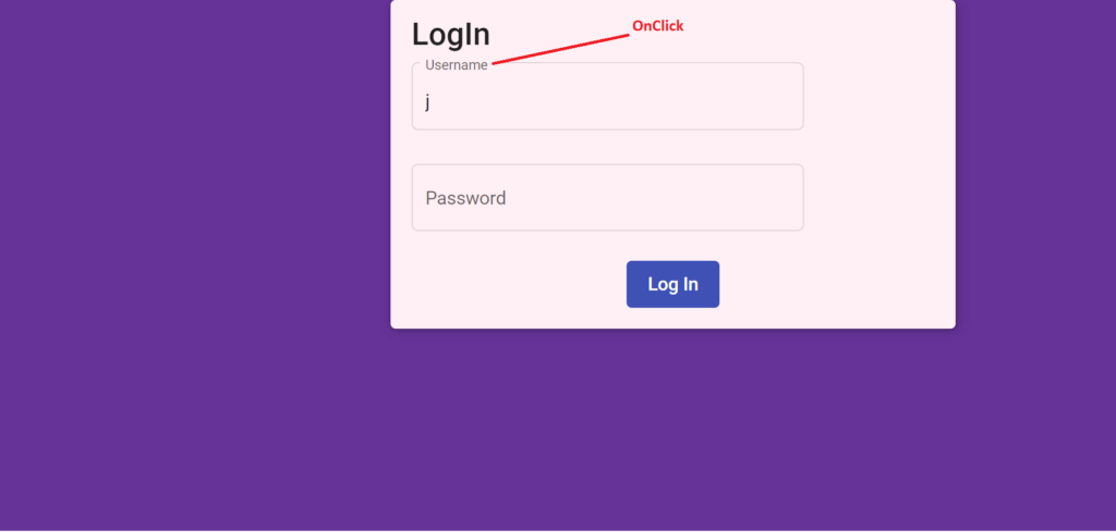
Angular Material Demo On Click
-
As you can see in this example you don’t have to do much for applying design, Angular Material will do it for you.
-
This example is just for Input fields and MatCard. You can do much more with angular material and you can use Material Icon as well.
Material Icon Example:
Step 1: You will have to import MatIconModule from angular/Material.
import { MatIconModule } from '@angular/material/icon';
And add this in @NgModule>Imports section:
imports: [
    MatIconModule
  ]
Here is the modified app.module.ts file:
import { BrowserModule } from '@angular/platform-browser';
import { NgModule } from '@angular/core';

import { AppRoutingModule } from './app-routing.module';
import { AppComponent } from './app.component';
import { BrowserAnimationsModule } from '@angular/platform-browser/animations';
import { MatInputModule } from '@angular/material/input';
import { MatFormFieldModule } from '@angular/material/form-field';
import { FormsModule, ReactiveFormsModule } from '@angular/forms';
import { MatCardModule } from '@angular/material/card';
import { MatButtonModule } from '@angular/material/button';
import { MatIconModule } from '@angular/material/icon';


@NgModule({
  declarations: [
    AppComponent
  ],
  imports: [
    MatIconModule,
    MatInputModule,
    MatFormFieldModule,
    FormsModule,
    ReactiveFormsModule,
    MatCardModule,
    MatButtonModule,
    BrowserModule,
    AppRoutingModule,
    BrowserAnimationsModule
  ],
  providers: [],
  bootstrap: [AppComponent]
})
export class AppModule { }
Step 2: Add the MatIcon component to the HTML page as shown. You can specify the name of the icon inside the mat-icon component.
account_circle
- You just have to provide the name of the icon you want to use inside the mat-icon component.
- You can acquire Icon’s list and preview on this website: https://material.io/resources/icons/?style=baseline.
Here is how the app.component.html file looks:
<div class="mainsection">
  <mat-card class="example-card">
    <mat-icon>account_circle</mat-icon>
    <mat-card-subtitle>Total User</mat-card-subtitle>
    <mat-card-title>1122</mat-card-title>
  </mat-card>
  <mat-card class="example-card">
    <mat-card-subtitle>Active Cars</mat-card-subtitle>
    <mat-card-title>122</mat-card-title>
  </mat-card>
  <mat-card class="example-card">
    <mat-icon aria-hidden="false" aria-label="Example home icon">assignment_ind</mat-icon>
    <mat-card-subtitle>Employees</mat-card-subtitle>
    <mat-card-title>22</mat-card-title>
  </mat-card>
</div>
Add some styles to app.component.scss.
h2 {
    text-align: center;
    color: cornflowerblue;
  }
  .mat-card{
    border-radius: 10px;
    box-shadow: 0 6px 10px -4px rgba(0,0,0,.15);
    margin-top: 2%;
    margin-left: 0.2%;
  }
Save the changes and navigate to http://localhost:4200 and you will have the following view:
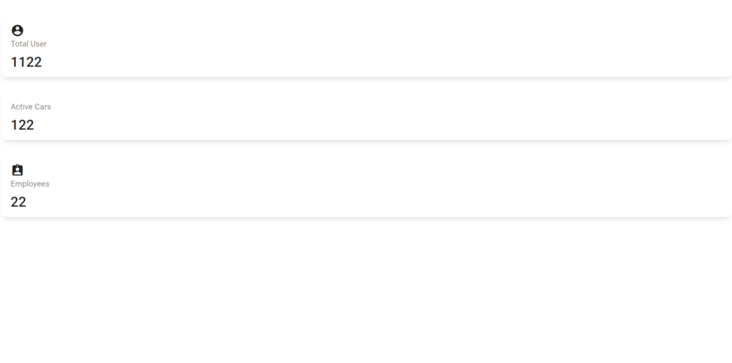
Material Icon Component
How to work with Angular Material with more efficiency?
- If you are using Angular Material in your application you might face a problem like which component/Field to import according to your requirement.
- To solve this problem, you can refer to the official Angular material site: https://material.angular.io/ and go to Component Tab.
- You will find all the available components there. Select the component you want to work with.
Let’s say you have selected a date picker.
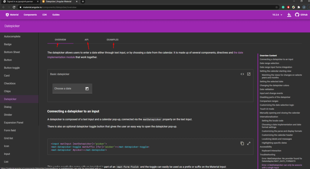
As you can see in the above image there are main three tabs:
- OVERVIEW: It will show a complete overview of the component whichever you have selected, it will contain a basic example to some advanced level example.
- API: Here you can find the import statement at the very beginning of the content area. You will also find every property available on that component.
- Examples: You can see a complete Example, from the import statement to HTML tags.
I would recommend reading the Angular Material Reactive Form Tutorial Series, where we showing details of how to get started with Angular Material and Reactive Forms in an Angular project.
Conclusion
If you are using Angular, in our opinion, you should use the Angular Material once for attractive Fields, components, and many more features. You might find how easy it is to implement a bunch of high-level designs into your project with Angular Material. Angular Material has a great community around the world, so if you get stuck at some point, you can find a solution with not much effort. For detailed information related to Angular Material, we would recommend referring to the official documentation.
Author Bio: Ajay Patel – Technical Director, iFour Technolab Pvt. Ltd.
A Seasoned technocrat with years of experience building technical solutions for various industries using Microsoft technologies. Wish sharp understanding and technical acumen, have delivered hundreds of Web, Cloud, Desktop and Mobile solutions and is heading the technical department at AngularJS Frontend Software Company – iFour Technolab Pvt. Ltd.